
Isn’t it all paint? Yes, but it’s not quite like that. This article can be helpful if you’re trying to decide on your company’s Interior design color scheme.
In the end, you’ll learn that the color palette you choose may have an impact on your employees and on your company as a whole.
Subtly, the color of your company may convey a message about your work environment’s productivity and purpose. Here are a few pointers for picking a color scheme that goes well with your office’s decoration.
Choosing a color scheme for your office
Choosing the right color scheme for your interior painting job is a daunting undertaking! It takes a lot of time and effort to come up with an original idea. You’ll want to keep these things in mind while choosing your color palette.
Do you have any interesting patterns or prints in your home or office? For example, a beautiful rug, a piece of art, or even a specific cloth, such as a blanket.
In order to generate complimentary colors and a color palette, it is possible to use a prominent print or pattern in your area as a starting point.
Think about color values and their right placement and dominance in a space. Professional painters and color experts often recommend using darker flooring colors (for example, a brown). For the inside wall painting, you may choose a medium color value, such as beige or tan. For the painting on the ceiling, use a pale cream or off-white. This helps to develop a color scheme that works nicely in the space.
Think upon a color scheme for the key parts of your home first. In an open-concept home, it’s critical that the movement between the kitchen/dining area and living area be smooth.
How to decorate using a color wheel
We’ve all seen a color wheel at some point, even when we were only learning about colors in elementary school. Adults may benefit from the use of a color wheel when selecting a color palette for home design. Look out some of the color combinations that you can obtain from a wheel of the rainbow!
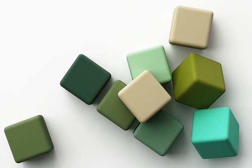
Creating a monochromatic color scheme is always the simplest of all the color schemes to come up with. There are many distinct colors, tones and tints within one color that may be used to create monochromatic designs.
If you choose the color blue, for example, everything in your design scheme will be based on shades of blue.
An example of tetrad (or rectangle) color schemes is a combination of four complimentary hues.
A tetrad color scheme may be created by drawing a rectangle between each of the four colors you’ve picked as your four main accents. There are equal amounts of each color on the color wheel when using this particular scheme of color.
The employment of a base color and the complementary color of that base color is known as a complementary color scheme. The color wheel’s complement is on the other end of the spectrum. An accent color is frequently used to compliment or contrast with the primary colors in the design.
Suggestions for a Color Scheme/Interior Paint Scheme:
It’s not uncommon to see things painted in shades of blue. Confidence, security, honesty, loyalty, and conservatism are all conveyed by the color blue. Labrador Blue is a cool blue that isn’t too dark.
Green is the second most preferred color, according to surveys. For centuries, people have connected the hue green with prosperity and tranquility. A richer, deeper hue of green may denote status and affluence. Despite its name, Green Monster is a gorgeous shade of green.

You might use an orange color scheme to balance out the powerful statement that navy blue conveys.
It has been shown that the color turquoise has a positive effect on one’s mental state. If you’re wanting to paint the inside of a marketing or advertising firm, this color can be a nice option.
Here are a few more pointers for selecting a color scheme:
It’s a good idea to keep in mind that the more cheerful the color, the less serious the workplace will look (depending on the type of business, of course). You’ll need to think about the kind of people who will be working at the office and coming in as customers. You want to create a professional feel in your business’s interior.
For example, if you want to paint a dentistry clinic or naturopath’s office, peaceful and serene colors would be the most appropriate choice. Blue, green, and yellow are some of the colors used in their creation.
Choose a color scheme that includes green and blue to create a productive work atmosphere. To balance out the color scheme and create a less stressful working atmosphere, use some warmer tones.
However, too much red in the workplace might cause mood swings and bad behavior. However, if there is too much orange or peach, it will create a convivial atmosphere that stimulates conversation. They would be ideal for a staff lounge, but not necessarily where the actual work is done.
Make sure that yellow is included into the color scheme of the space if you want to use it for note-taking and training. This color has been shown to help individuals absorb and remember more information by painting their interiors in this shade.
Theory of color and color association
Did you know that there is a scientific basis for how each color affects you? Even a little variation in saturation (the degree to which a color is strong or weak) may have an enormous impact on the way you feel and think about a certain color and its effect on your mood.
Color theory is at the heart of it all. When it comes to working with color, there’s an art and a science to it. What matters most is how a color makes you feel when you see it. In addition, when individuals enter a space with a certain color scheme, they feel more at ease.
What you need to know about color theory.
Let’s go through the fundamentals of how different colors on the color wheel affect individuals. To get you started, here are the primary colors on the color wheel: red, yellow, and blue. These colors are blue, red, and yellow. That time in elementary school when we first learnt about them? There has always been a strong connection between these colors and every other color in the spectrum. 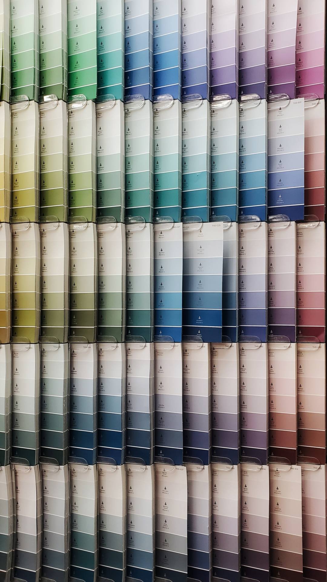
Violet is a color that may be created by mixing red and blue, for example. There are also transitional colors, such as blue-greens or red-violets, that fall somewhere in between. Let’s take a closer look at it.
cooler shades
Colors like green, blue and purple make up the colder end of the spectrum. For a more subdued and natural design, these are all excellent choices since they tend to conjure images of water, sky, and the great outdoors in general. It is common for these colors to induce sentiments of serenity and calmness.
The color blue is utilized in a wide variety of ways, particularly in design. Light blues have a calming effect on the mind and body. If you have a lot of traffic in your kitchen or living room, a warm and inviting color like yellow might be a good choice for the area. Colors with a darker shade of blue might conjure up thoughts of power and stability in the viewer. Color blue has many implications that are deep and expansive, like the ocean.
Another color that appears in many different places is green. Because it used to be the color of money, some people typically connect the color green with prosperity and vigor. Green is generally associated with fresh growth, nature, and the ground, plant life, and trees. Green may also express a feeling of balance and harmony since individuals typically experience a sense of security and anchored-ness toward it.
Purple is a mix of red and blue, and as a result, it may take on traits from either one or the other. If you’re looking for something with a more romantic vibe, go no further than light purples. Some individuals, when they see a wonderful light purple, also think of springtime and flowers. Due to their historical background, many deeper and mid-range purples conjure images of monarchy and riches.

Brighter hues
Increase the level of warmth in our color schemes even more. Reds, oranges, and yellows, as well as all of their variants, make up the majority of the palette. The sun and fire are all represented by these colors, which may be seen in abundance throughout the autumn season.
Use of warm colors and their variants may often convey a person’s enjoyment, passion, and excitement in their house. With a warm color, you may create an energetic atmosphere in your home or office.
It is very strong when employed in design, to the point that some individuals find it too overpowering in excessive amounts. If you want to convey power and aggressiveness while yet maintaining an air of refinement, you may choose deeper colors of red to achieve this goal.
Orange is a lively and energizing color to include into a space. Because it’s the color of fall, there’s a chance of a connection to the soil. Stepping into an orange-themed space might inspire some people’s imaginations. The fruit, on the other hand, conjures up images of excellent health and vitality.
Brightness and pleasure are nearly usually linked to the color yellow. Many people associate brighter yellows with hope, which is why they are often utilized in nursery décor for both boys and girls. In a colorful workplace atmosphere, a touch of yellow could also aid with productivity.