
Searching for the best paint colors for apartments & condos in 2023?
The colors chosen for condos and flats convey a lot about what living there is like. Along with picking the appropriate colors, you’ll need a qualified team to complete the project on time and within your specified budget.
It might be difficult to choose colors that complement your architectural characteristics and other property features. Yet when it comes to the newest interior and outdoor paint trends, we’ve got you covered from kitchens to bathrooms, living rooms to bedrooms.
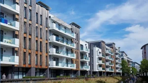
Exterior Paint Colors
The aim is frequently to avoid being either too flamboyant or too boring for those in charge of choosing the outside paint color of apartments and condominiums.
The design of the property will determine a lot of the color scheme, but it’s also important to consider the area and the interests and preferences of the current and potential residents.
If the building is small, consider using lighter hues to accentuate its size. Consider line or ivory if white is too glaring.
Dark colors, such as on shutters, doors, and trim, can also be used sparingly to lend a little drama to the outside. Darker hues can also be employed to partially conceal any aesthetic defects that the structure may have.
Whichever colors you decide on, be sure to choose a reputable painter to apply them to the walls. If the colors aren’t used properly, even if you pick the ideal mix, you won’t reap the rewards.
10 Best Paint Colors for Apartments and Condos
Color preferences for paint change from year to year. The colors of the 1940s and 1950s were red and turquoise/mint, respectively. Green became the in-thing in the 1960s, but in the 1970s it changed to a more mossy green. The 1980s were the decade of mauve, and the 1990s were the decade of purple. Over the past few decades, preferences have shifted from light blue to gray, but more lately, we’ve noticed a return to blues.
If you ask anyone what the ten trendiest paint colors are right now, you’ll probably receive a variety of answers, but these are certainly within the top ten for many people in charge of painting apartments and condominiums:
Deep Blue
It follows the current fashion in which blues are the color of choice for spaces where architectural details can be emphasized.
Sage
Sage is a quiet and soothing color that soothes residents’ stressed-out nerves.
Earthy Ochre
This color works beautifully in living rooms and other spaces where warmth is crucial when combined with other warm tones.
White oyster
Oyster White is a better option than sterile white paint and is sometimes referred to as “greige” due to its location between beige and gray.
Heavenly White
Some areas require more sterile hues, but Divine White can help you avoid crossing too much of that line.
Silver
Silver is a fantastic hue for smaller rooms since it has a more contemporary vibe and a hint of refinement.
Green
Green tones are another popular trend; they look great in spaces that require the extra warmth this color provides.
Sky Blue
Sky Blue will brighten a dimly lit room or one that is closed off.
Beige
Apartments and condos frequently use neutral colors, but mixing beige with other neutrals can have a striking effect.
Light Gray with White Trimming
It’s a traditional combo that has never truly lost favor in condos and apartments.
Suggested Paint Colors for Different Parts Of Your Home
Whole Interior
You can keep a neutral theme throughout a unit without sacrificing aesthetics rather than painting the entire apartment or condo a flat white color. Consider decorating the space in a variety of shades of gray, white, beige, and earth tones if the aim is to make it appear welcoming but you know the new occupants will eventually select colors that reflect their own preferences.
Living Room
You can use paint to add interest to your living room if it lacks any architectural characteristics that are particularly noteworthy. But paint can also draw attention to architectural details that are already there and that you wish to stand out a little more.
For a stunning look in your living room, use the colors Pure White, Charcoal Blue, and Austere Gray in the proportions of 60:30:10. Use a blend of Moderate White, Dover White, Macadamia, and Wool Skein for a look that is more natural.
Bathroom
Bathrooms are small areas that might benefit slightly from a color combination, so in some cases you can be a little more daring in your selections. A dark Black Magic accent, for instance, works beautifully with the mid-green Garden Spot and the tan Double Latte hues from Sherwin Williams. You can choose several gray hues, such as Rhinestone and Gray Clouds, for a lighter look, but you can also add a vivid accent color, like Cajun Red, to make the space stand out.
Kitchen
Kitchens can have a variety of characteristics based on the hardware, flooring, countertops, and cupboards that are already there. You can adopt a modern, rural, rustic, or traditional strategy. One of Sherwin Williams’ best kitchen paint colors, Blue Sky, will provide airiness to the space if your kitchen receives little natural light.
You might use the rust-colored Cayenne paint in kitchens with lots of natural light and a paler shade of grayish-tan Wool Skein to balance it out.
Bedroom
Choosing a soothing color scheme for bedrooms is a common trend. Nowadays, Neutral Ground, an off-white color, is a popular paint color for bedrooms. Choose Celestial for your bedroom if you want to stick with the fashionable blue color scheme this year. It will make the space brighter while yet having a peaceful impact. Check out the teal-like hue Drizzle and the off-white choice Downy if you’re trying to mix colors.
Is Your Condo Small and You Would Love To Make It Look Bigger?
Using lighter hues is a tried-and-true trick for making a small space appear larger. In actuality, a wall seems taller when a lighter hue is utilized above the eyeline. Even though bathrooms are typically the smallest rooms in apartments and condos, this does not mean that they must always be painted white. In fact, you can enhance the transforming power of this space by using a bold hue.
Soft blonde paint with white trim can be used to “warm up” small condos and apartments.
Particularly in tiny spaces, beige is a neutral color that is rarely out of style. In some other small rooms, you might even find a return to the 1950s with a mint green alternative, which can give the small area a more lively air.
Pearl gray has long been the go-to color for tiny rooms where white is deemed too antiseptic; nevertheless, soft yellow can also be used for a cheerier effect. Sage, a light shade of mossy green, looks great in compact spaces with lots of natural light. Sky Blue also does a great job of elongating the appearance of a space.
Five Techniques to Make an Apartment Look Bigger
Let’s face it: compared to the typical home, condos and apartments are frequently significantly smaller. How therefore can we make these snug areas appear larger? Here, the color schemes of your residence may make all the difference, and we’ll show you how to achieve it.
Use Single Paint Color Themes
Use a single color to paint the entire small or studio apartment to help the room appear larger. By making the room appear larger than it actually is, this will help you open up your apartment or condo.
By painting every surface the same color, barriers between rooms are eliminated, making it easier to connect spaces without visually splitting them up by color, which can make a room appear smaller.
We suggest using a lighter neutral shade that will work in every room.
Go With Bold Shades
To help breathe a little extra life into a small space, go for bold colors. Big, rich, bold shades help add vibrancy to small apartments, livening up the space, and subsequently, making it feel more open.
This helps the mind focus more on the apartment colors, and less on the actual size of the room, making the colors the focal point. We recommend sticking to one bold color not to create a mismatched, disjointed feel in your small space.
Solid Hues
To help make walls feel less two-dimensional, use solid colors to paint your apartment. Solid shades will add depth to your space, making it feel larger. Not sure what we mean? Let’s explain.
When thinking about solid colors, we are almost getting into color blocking. So, if you paint your walls a beautiful yellow, a deep orange opening in the space will help add depth, using the two solid colors to open the space and create emphasis that makes it feel larger.
Disguising Low Ceilings
Low ceilings are one of the primary reasons apartments can feel small. Creating an almost claustrophobic space, even the largest apartments will feel smaller if the ceilings are low, so how do we mitigate this?
To disguise low ceilings, it’s essential to move beyond the walls and consider condo paint ideas for the ceiling. White, light blue, yellow, and beige ceilings can help open the space and make it feel larger. As part of this, you want to make sure the color you choose for the ceiling is always lighter than the walls, making them feel lifted and the space more open.
Add a Pop
When it comes to home décor, you always need an element of surprise. To add décor pops, you want them to be cohesive with your paint colors, but you can also work with the existing structural components of your space.
Take a radiator, for example. Sure, it isn’t the most beautiful thing in the world, but how about painting it a bright color, surprising guests by using it as an accent piece? Or, paint an accent wall that compliments your furniture, making your space feel vibrant and alive. There’s no reason you can’t use apartment paint ideas to show off your creativity, right?
Paint Colors To Avoid for Rental Properties
Renter turnover implies that potential tenants are almost always checking out apartments to determine if they meet their needs. Because of this, you should stay away from vibrant and daring hues. While some people adore paint in this manner, the majority will not be drawn to these colors.
People appear to either admire or despise bright yellow walls, for instance. You should stay away from that color because there isn’t much of a middle ground here. Avoid using vibrant red and orange colors since they could make potential tenants feel uneasy.
While there are many different shades of blue that are fashionable right now, avoid vivid blue because most people consider it to be on the “hate it” side of their color preferences.
Conclusion
In conclusion, choosing the right paint color for your apartment or condo can make a huge difference in the overall look and feel of your living space. With the latest 2023 trends in mind, you can transform your home into a stylish and inviting sanctuary. Whether you prefer bold and vibrant hues or soft and soothing tones, there is a perfect paint color out there for you. Remember to consider factors such as lighting, room size, and personal taste when making your selection. By following these tips and staying up-to-date with the latest trends, you can create a beautiful and comfortable home that you will love for years to come.