
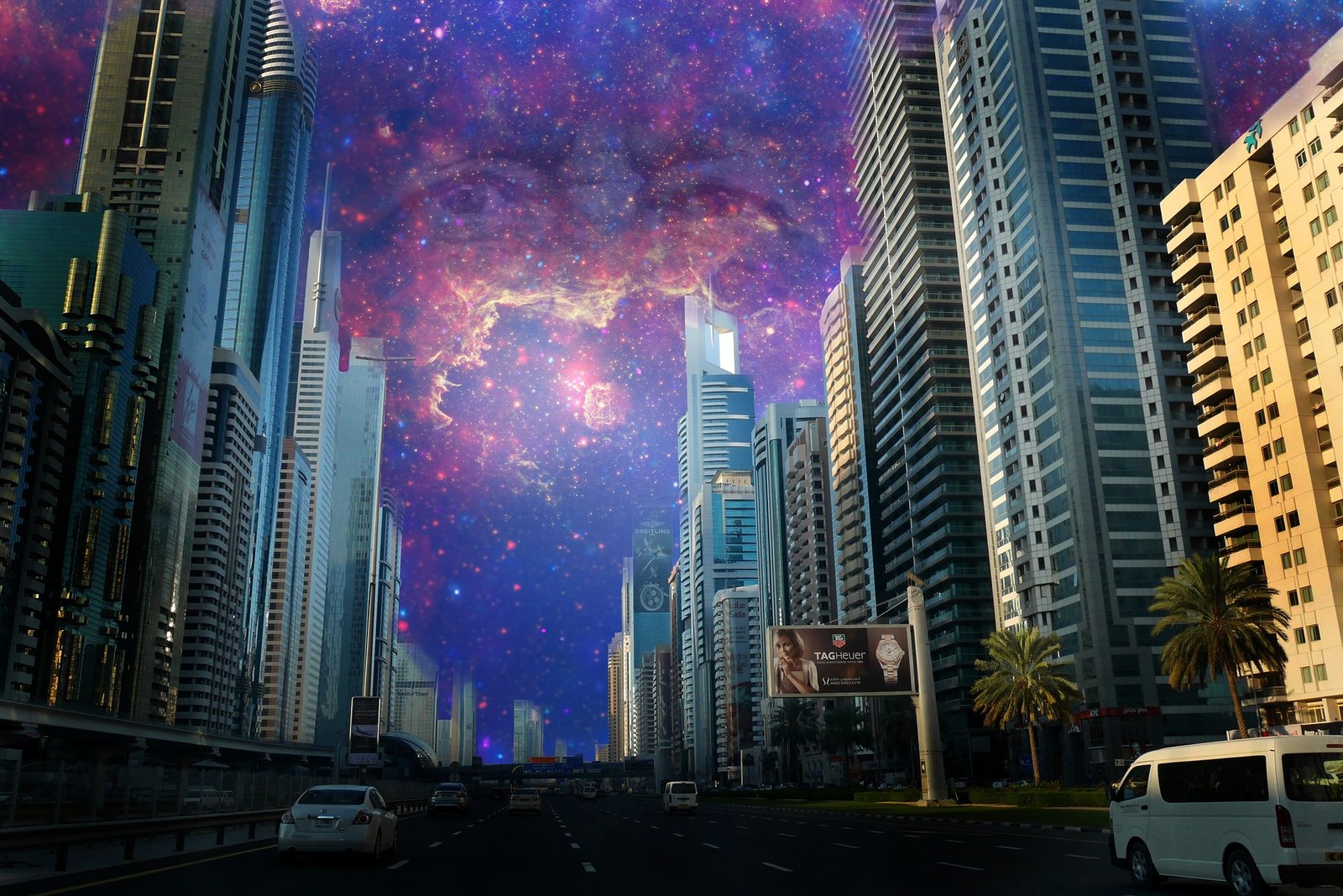
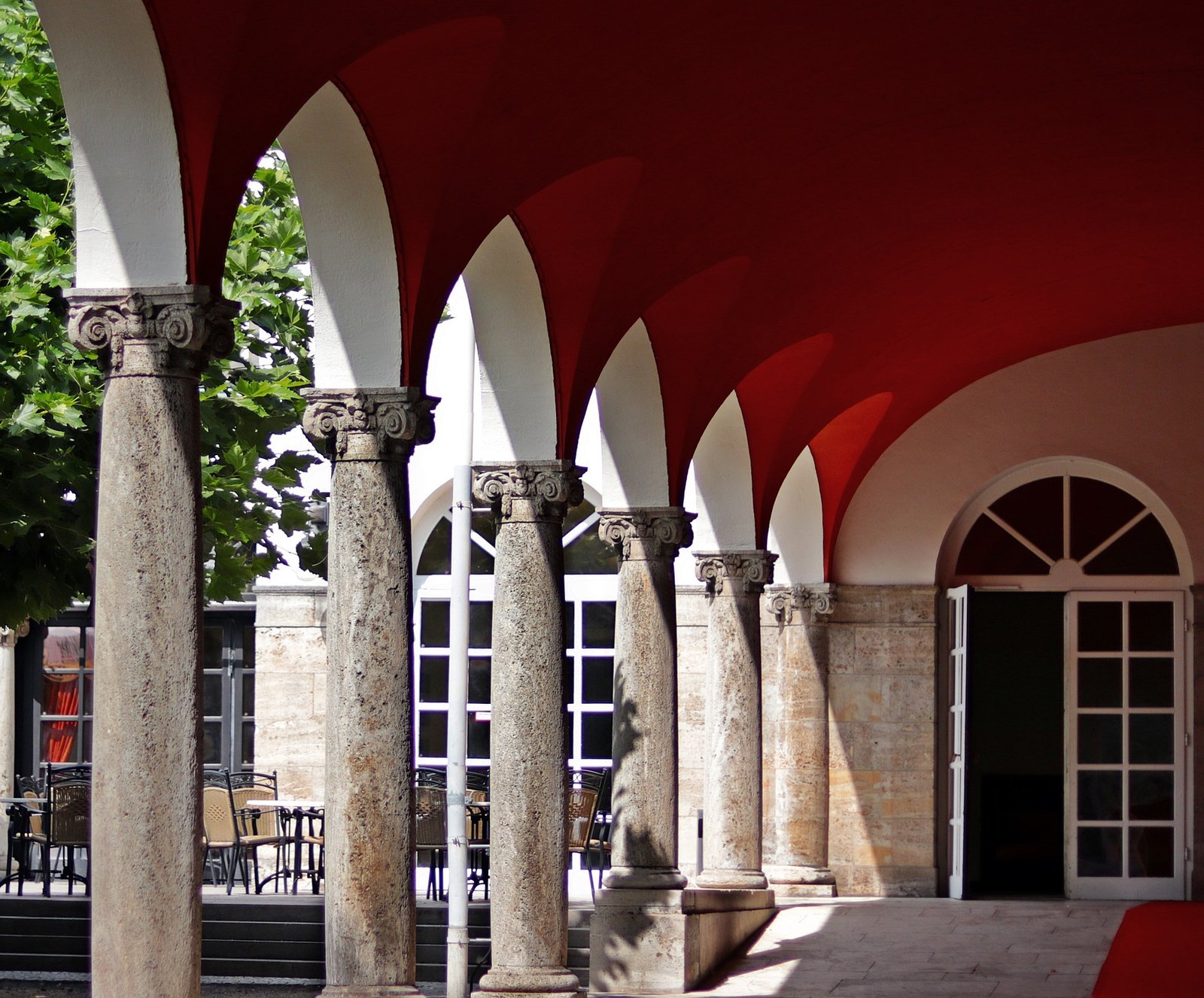
Every business decision you make is critical. A lot can be said about your company’s image just by looking at your business space, which includes everything from the exterior signs to the interior design. Customers and staff alike will be affected greatly by the color you pick to paint the interior of your business. We’ll look at why it’s so essential to think carefully about the color of your offices in this piece, and what that choice says about your company.
The importance of picking the appropriate color for your business
It’s critical to grasp the significance of color before diving into what it says about your company.
Emotions and sensations are evoked by a wide variety of hues. They also have an effect on our emotions. As a result, the color of the walls of your office will have an impact on everyone who enters. It influences their perceptions of your company.
People’s behavior can be influenced by color selections as well. Yellow, for example, is a highly imaginative hue that may serve as an inspiration in design workplaces. It’s a lot more crucial than you would think to choose colors carefully.
Because of this, it is imperative that you thoroughly plan out the type of business space you want to build. A smart and opulent workspace requires colors that reflect this. You’ll need colors that play nicely together if you want to design a commercial workplace that is serene and relaxing. The atmosphere you want to create in a space, as well as the kind of brand image you want to project, are profoundly influenced by the colors you use.
When it comes to color, it’s not only about what you pick, but how much of it you use, as well as how you combine it with other colors. The appropriate color combinations might help you generate a sense of harmony in your workplace. On the other hand, too much of a specific hue might tip things off, giving off the incorrect vibe and even driving employees to irritation. It’s a delicate balancing act, which is why it makes sense to hire a professional painter.
What message does the color of your business convey?
Now that you know the importance of color psychology, let’s look at what each of your company’s colors says about it.
light-blue
In order to begin, light blue is the only option. Why? It’s no surprise that light blue is such a popular choice for business interiors. Accountants, for example, benefit greatly from working in a bright blue workplace because it gives them the optimum environment in which to perform repeated activities with extreme concentration and efficiency.
Light blue is a calming, energizing hue for the mind that promotes clear thinking and relaxation. Loyalty, trust, and orderliness are all enhanced as a result.
In addition to deciding on the most prominent color in your office, you should think about what additional colors go well with the light blue hue you’ve chosen. Orange accents are a good way to keep things in balance while also injecting some energy into the room. Instead of pairing blue with white or another neutral color, you may wish to do so to avoid making the room appear chilly and uninviting.
Sky blue has a relaxing and revitalizing effect on the mind and body. Using it at a doctor’s office is common since it can help calm worried patients.
Purple
Purple is the hue of royalty, so it’s the ideal option for a workplace that wants to exude opulence and majesty.
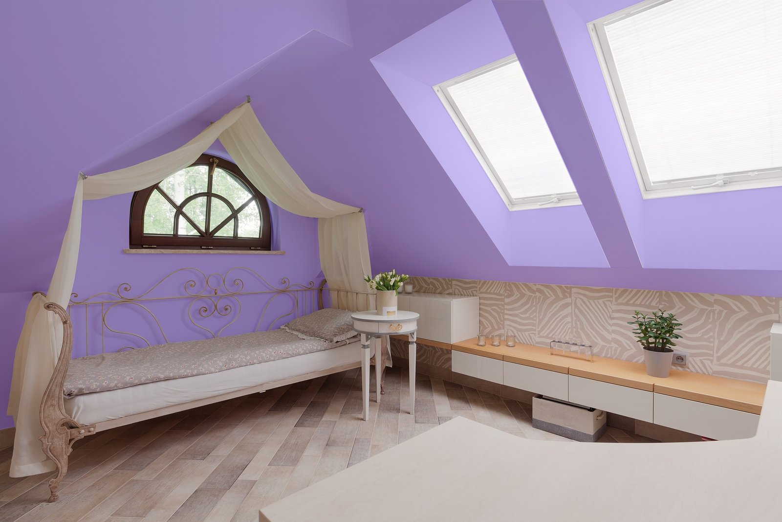
Using it to design your commercial space might convey to your customers that you are the greatest in the business because it is also a hue associated with the highest quality. A lot of this stems from a time when purple was a pricey pigment that could be afforded only by the very wealthy, like royalty.
Purple may also have a mystical and magical sense to it, which evokes images of romance and imagination depending on the colors it is matched with. However, if you use too much purple, you’ll create a dismal atmosphere, so be careful.
White
Paint the walls white to make any cramped office appear lighter and airier. White also creates a feeling of balance and neutrality, allowing it to disperse strong hues. White is a symbol of cleanliness and purity in color psychology.
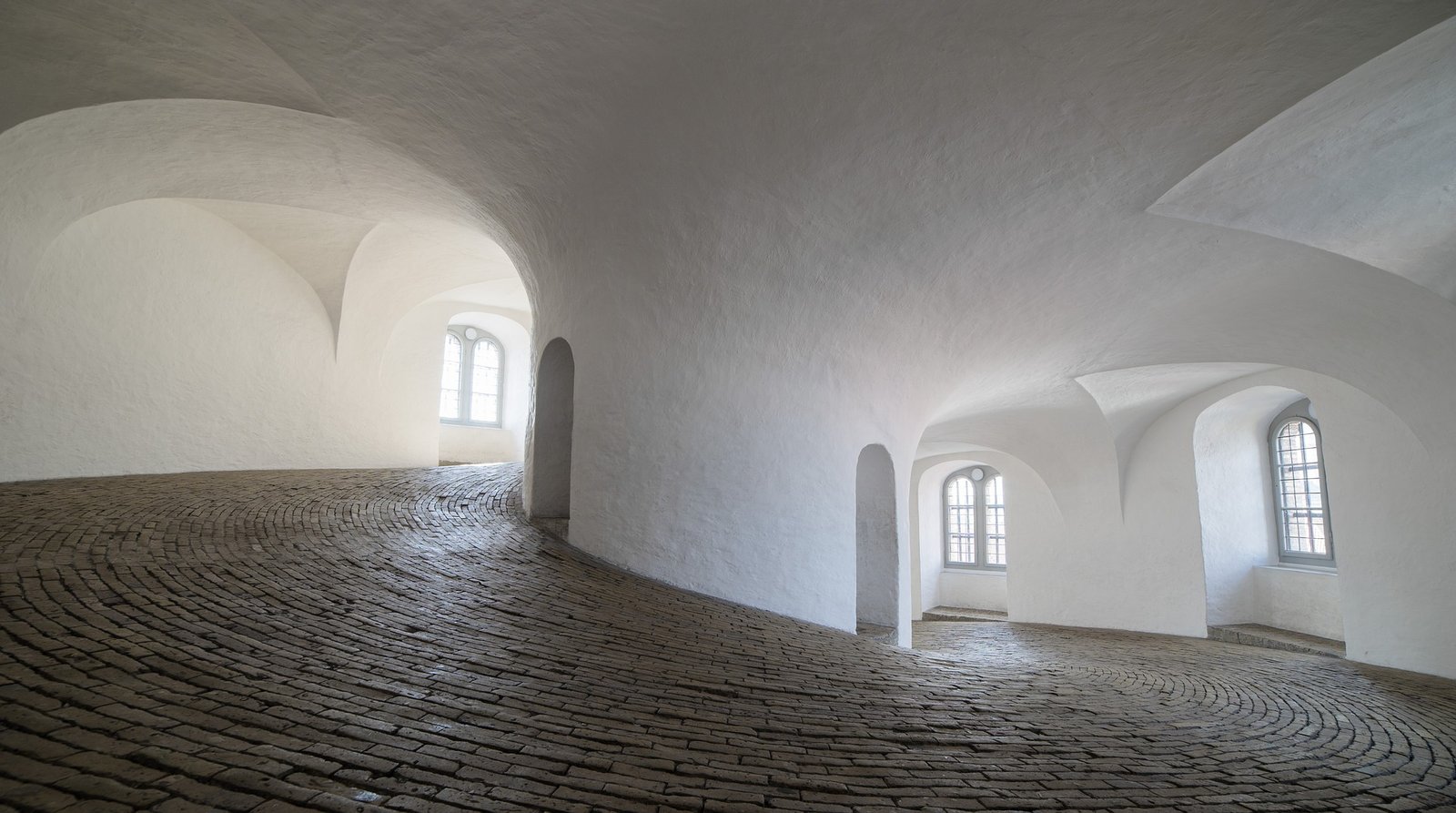
A reoccurring topic in this article is to stay away from utilizing an overabundance of a single hue. White is the same. Using too much white may make a room appear sterile, uninteresting, and uninviting.
To avoid looking too stark, opt for a warmer, softer off-white instead of pure white.
Pink
As a hue that evokes feelings of optimism and romance, as well as femininity, pink is an ideal choice. That’s why people use phrases like “everything is rosy” and “pink” to describe their state of mind.
Because pink is so near to red in hue, it shares some of red’s dynamism and warmth without being overpowering. Colors such as these can even be used to help you relax.
If you’re in the business world, you don’t want your employees to feel like you’ve abandoned them. You don’t want them to be aggressive.
While pink may be used as an accent color or a single wall color, too much of the color can be claustrophobic, emasculating, and depleting if used in excess.
Brown
The combination of a dark brown wall and dark wood furniture produces an office that exudes strength, authority, and manliness. Despite its earthy hue, it has many of the same properties as black and is therefore more comforting and reassuring. Stability and hard work are also conveyed by this word choice.
Adding blues and greens will help keep your office from feeling too dreary. Ivory may also be used to create a professional and stylish corporate environment.
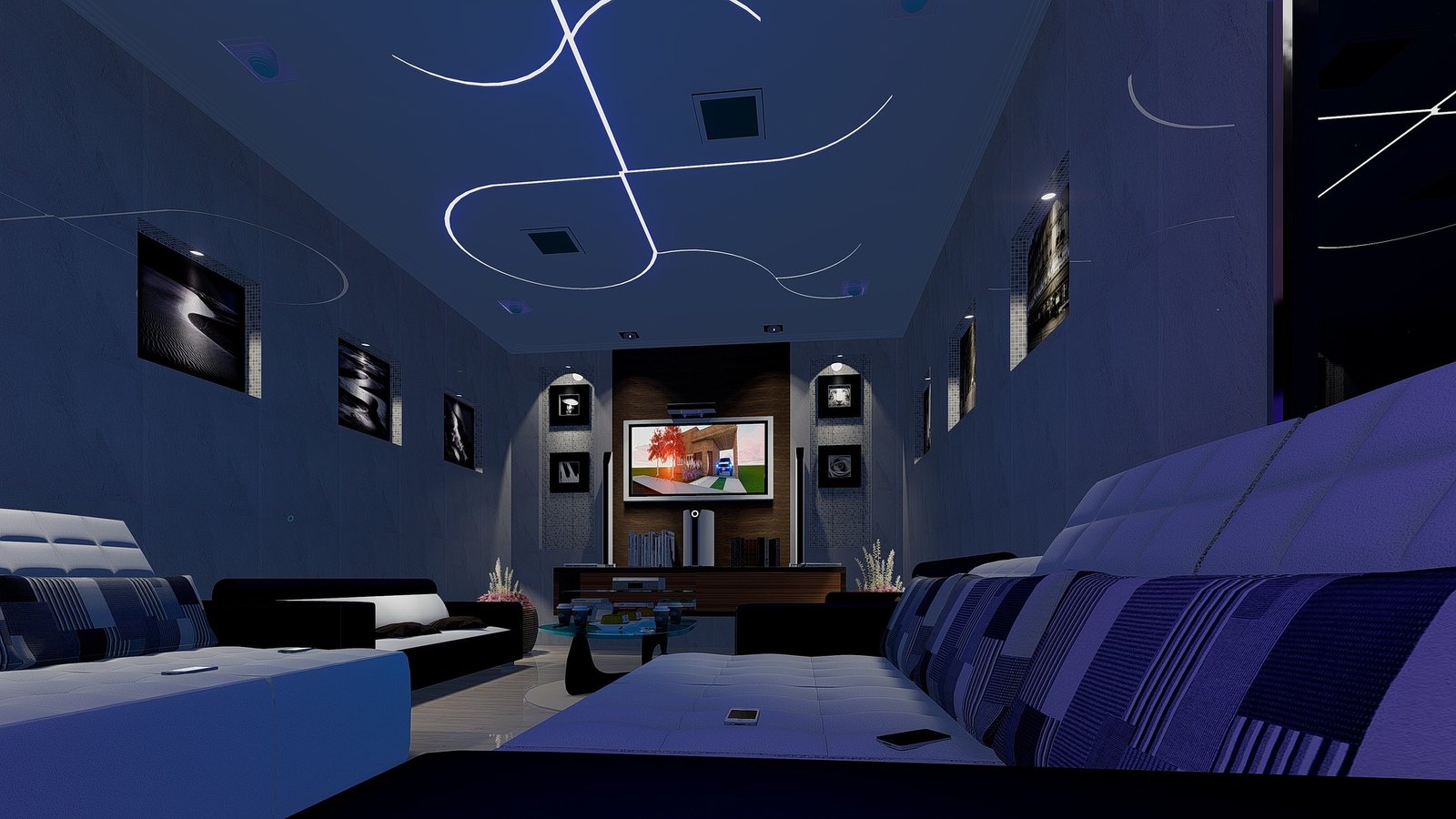
Black
There are few colors as authoritative as black for conveying the concepts of authority, control, and power. As long as the right accents are employed, it may also make your office appear classy. Because too much black might look frightening, you should use it with caution.
Black is an excellent color to use when you want to seem elegant while also asserting your authority. If you’re going for a glitzy look, gold is always a smart choice as a complementing hue.
Using a dark color like this one may help you project a sense of refinement and formality, making it an ideal choice for a business setting.
Green
Green is a soothing hue that will be appreciated by those who spend long hours at their desks. It’s the least taxing on the eyes, yet it’s a great source of subtle stimulation all day long. This might assist you in maintaining high levels of productivity and efficiency.
It’s also a hue that’s connected with good health, serenity, and the preservation of the environment. Charities and other non-profit organizations frequently make use of it.

Green is the most prevalent color in nature, providing a sense of security and calm. Consequently, it comes as no surprise that it is linked to a sense of equilibrium and well-being. Low-wavelength hues like this one are also good for medical offices to assist patients relax, as well as for finance offices where money is exchanged.
Yellow
The “memory color” is yellow since it aids in the retention of knowledge, which is always a good thing in the job! A yellow wall behind the whiteboard might be strategically painted to assist staff recall knowledge during their training sessions. Yellow, on the other hand, is a bright and lively hue that may lift people’s moods.
All of us want to create a happy and inspiring work environment, and yellow may play a role in achieving this goal. Vibration, self-esteem, optimism and warmth are all associated with this color.
It’s a hue that’s known to lift people’s moods and give them a sense of self-worth. Yellow may be deliberately used in parts of the workplace where teams operate to foster warmth and accessibility.
The color yellow inspires a lot of imaginative thinking. It looks like the sun. Yellow, a cheerful and uplifting color, energises everyone in your workplace, igniting the creative juices and promoting creativity.
Yellow, on the other hand, has the unpleasant side effect of making people crave food! A lot of your employees will wind up spending half their days at the vending machine if you utilize it too often.
Red
There’s a lot of discussion over whether or not red should be allowed in the workplace. This is due to the fact that red is the most stimulating hue; it raises the heart rate and blood flow. Due to the high level of physical activity and mental alertness required in many workplaces, this is a highly effective hue.
Red, on the other hand, should only be used in small doses. It’s never a good idea to repaint a commercial facility in bright red. Doing so might lead to feelings of frustration, resentment, and even a heightened sense of competitiveness among team members. It’s best utilized for accents, decorations, and furniture, with a neutral color palette to counterbalance the red.
Orange
The colors red and yellow are combined in orange. Yellow and red are a fantastic match for each other in this piece. You can invigorate your body and mind with this shade.
Orange is a vibrant and exuberant hue that represents energy and optimism.
In the end, though, if you employ an excessive quantity of orange, you risk turning your business into a child’s play area. Because this is counterproductive, you don’t want to over-socialize the atmosphere.” So, like with most colors, the key is to get the right proportion.
Keep in mind what other colors you’ll pair with orange to get the ideal harmony. Adding a pop of color to a bland space is as simple as painting one wall orange. People will be able to get through the afternoon slump more easily if they have more energy to work with.
Orange can bring out the best in a team that is known for its imaginative and creative thinking. It fosters a sense of security and well-being that encourages employees to perform at their peak potential.
Orange is also a color of happiness and friendliness, denoting warmth, grit, vitality, and a sense of accomplishment. A good and happy work environment is something we can all try to achieve.
Extroverted orange is a great choice for collaborative spaces and informal office lounges since it promotes interaction and socialization.
Whatever your color choice for your commercial and business space is, we at Lucky Painting Limited have the expertise to bring your space into a new era of freshness like never before. Our hotline ensures you can reach us even in odd hours, we get back faster than others. Do you want a free estimate that is budget friendly? Call Us now