
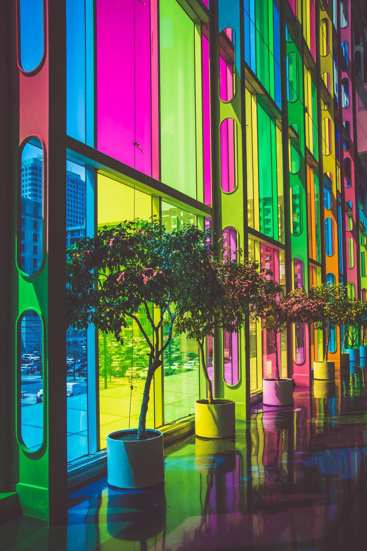
The most popular colors for interior and exterior painting change from year to year. The 1940s were all about red, while the 1950s were all about turquoise/mint. In the 1960s, vivid green was the go-to hue, but in the 1970s, a more mossy green became the go-to color. The 1980s were all about mauve, while the 1990s were all about purple. We’ve seen tastes change from light blue to gray over the previous several decades, but most lately, we’ve seen a return to blues.
When it comes to painting your condo or apartment, there are things you should do and things you shouldn’t do, just like with any home improvement job. There are several factors to consider when choosing a color scheme, however the following information might assist you.
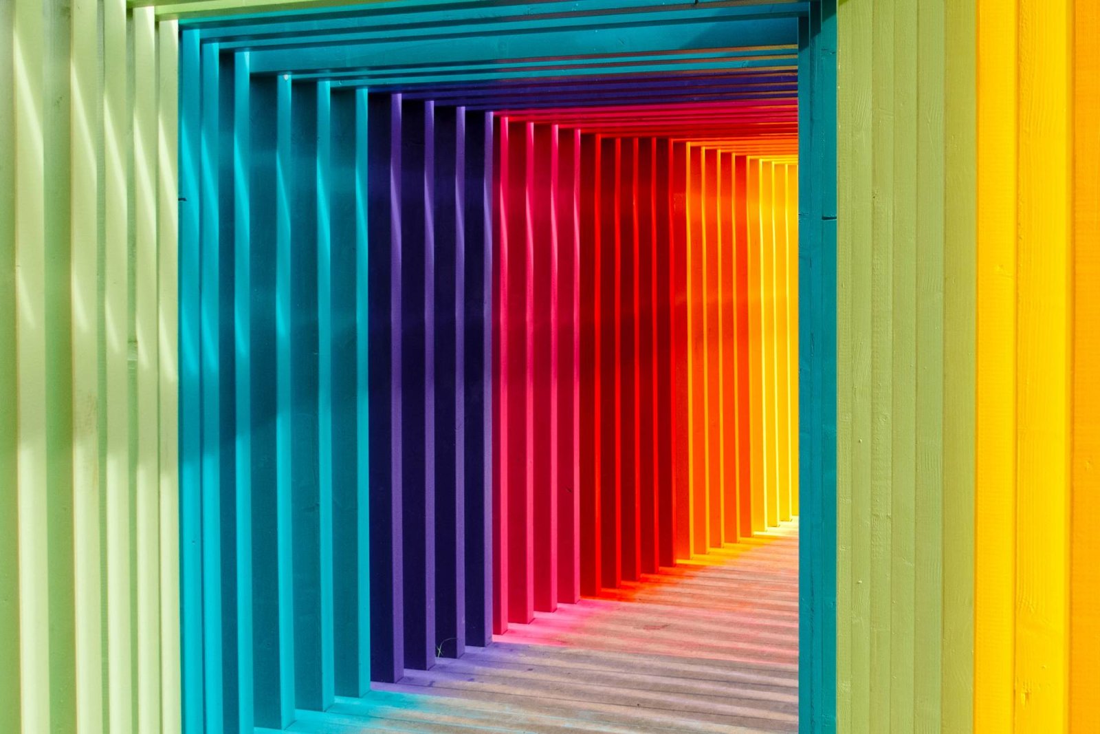
When it comes to color palettes, there are a few guidelines to follow. Except for the most trusted design specialists, you should follow these guidelines: 60:30:10.
In order to prevent making color combinations that don’t work, you need to know this ratio. Throughout essence, you’re deciding on a dominating hue that will be utilized in at least two-thirds of the area in your apartment or condo.
A color that complements the primary color without dominating it should be your choice for the secondary color in your scheme/combination. You’ll need to use half as much paint with this hue as you did with the primary one. If you’re going to utilize a third color, it should be an accent color. While it will bring a little “pop” to the area, the accent color is not intended to be overpowering.
Colors for the inside of a home
For owners and administrators of apartment and condominium complexes, selecting the proper paint colors may be a difficult task. When it comes to selecting a paint color, there are a plethora of alternatives to consider, as well as other details specific to each house (s). However, there are a few hues that seem to be a safe bet for most people since they fall within their preferences.
White Dove, White Heron, Swiss Coffee, and Calm are some of the most popular Benjamin Moore paints in neutral tones. You may choose the colors of your unit based on what is around you. With natural wood cabinets, for example, you’d select a hue that complemented the color of the cabinetry.
A good painting contractor is essential once you’ve decided on the proper colors for your home’s inside. Professional painters get the work done quickly, effectively, and with results that no do-it-yourselfer can come close to achieving. The investment is well worth it.

Colors for the outside walls
Exterior paint color decisions in apartment and condo buildings are generally made to avoid being either excessively gaudy or dull. The design of the property will play a large role in determining the color palette, but the neighborhood and the preferences of the existing and future inhabitants will also play a role.
Choosing brighter colors may make a smaller structure seem bigger. Line or ivory may be a better option if white is too glaring.
In addition to using dark hues sparingly on the outside, consider doing so on the shutters, doors, and trim. Also, darker hues might be employed to disguise minor defects in the building’s appearance.
It doesn’t matter what colors you pick as long as you get them painted by a reputable painting contractor. Even if you chose the ideal color scheme, you’ll receive no advantage from it if it isn’t implemented properly.
You should experiment with different color schemes in your condos.
To create a certain atmosphere in a space, you need to think about the colors you want to use. If you want to keep things neutral, you may use any mix of beige tones while adhering to the 60:30:10 ratio, if you choose. Gray and brown come in a variety of tones that might also be considered neutral.
Do you want to add some coziness to your abode? It works because they are more bright, make a room stand out a little more, and excite the brain a little more. Colors like sapphire and mustard may be utilized in more daring ways, but they should be used sparingly since they may not appeal to everyone. Royal blue and orchid are a fashionable color combination these days, and they look great in certain kitchens.
Consider using mint and soft gray to brighten up a room. If you’re decorating a kitchen or another area with little natural light, this combo would look fantastic.